The Art of the Double-Take: Building UK Brands That Reward a Second Look
Most brand identities are designed for the first glance. The shelf blink. The feed flick. The half-second before someone decides whether to keep looking. That is understandable, because first glances are where attention is won or lost. But a first glance is also cheap. It is a reflex, not a relationship. The brands people remember are usually the ones that earn a second look — the tiny visual hitch that makes the brain say, 'hang on, what was that?'
That is the dizzy dividend. Not chaos for the sake of chaos. Not design that makes people work harder than they should. Controlled visual disorientation: a deliberate, repeatable set of moves that interrupts the expected pattern just enough to create a memory. As UK marketing teams plan 2026 activity, it is worth asking whether your identity is built only to be seen, or built to be looked at again.
First glance is a reflex. Second look is a decision.
Clean, predictable identities are not wrong. They are useful. They reassure, they scale, they survive a thousand PowerPoint decks. But they also have a habit of behaving like background music. You notice them, you do not remember them. In crowded UK categories — grocery, fintech, hospitality, retail — the safest visual route is often the fastest route to being filed away.
The alternative is not to make everything loud. It is to design a small amount of productive friction. An unexpected crop. A layout that leans when you expect it to sit straight. A typographic rhythm that skips a beat. These are not decorations. They are memory devices.
Think about the brands that tend to stick. The hot coral of a Monzo card is a first-glance signal, but it is also a second-look anchor because it refuses to blend into a wallet. The chatty confidence of an Innocent label invites you to read the side of the pack, not just the front. The Paul Smith stripe is a simple system, but it creates a recognisable jolt wherever it lands. None of these examples are confusing. They are distinctive because they preserve clarity while adding character.
The dizzy dividend, defined
A second-look system has three ingredients: a stable anchor, a controlled oddity and a repeatable rule.
The stable anchor is the thing that keeps people oriented. It might be a fixed logo position, a consistent colour field, a clear typographic hierarchy or a recognisable photographic treatment. It is the floor beneath the furniture. Without it, disorientation becomes noise.
The controlled oddity is the move that creates the hitch. A product shot cropped so the hero item is almost off-frame. A headline set at an unusual angle. A block of colour that breaks the grid by a few degrees. It should feel deliberate, not accidental. The oddity is the wink, not the whole face.
The repeatable rule is what turns a one-off trick into a brand behaviour. If every campaign uses a different kind of surprise, you have not built a system. You have built a series of stunts. The rule might be 'one asymmetric element per layout' or 'the headline always breaks the margin once' or 'the product is always seen from an unexpected height'. The rule is what makes the second look feel like recognition rather than randomness.
Where to deploy it
Packaging
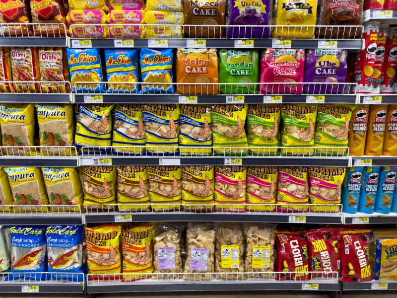
On a UK supermarket shelf, the first glance is often a category cue. Shoppers scan for colour, shape and familiar codes. A second-look pack does not abandon those cues; it adds a small visual question. A side panel that reads like a note. A window that reveals the product at an odd angle. A type treatment that makes the ingredient list feel like part of the design. The test is simple: can someone still find you quickly, and can they find something new when they pick you up?
OOH
Out-of-home is a first-glance medium by nature. People are moving. But motion creates time, and time creates the chance for a second look. A rail-side poster can use an unexpected crop to make commuters glance back. A roadside site can use asymmetry to break the usual rectangle. The guardrail is distance. If the idea only works when you are standing still two metres away, it is not an OOH idea. It is a print ad with a bus stop attached.
Digital
Digital is where second looks are easiest to waste. Endless scroll rewards pattern-breaking, but it also punishes confusion. The best digital second-look moments are small and rhythmic: a card that sits slightly off-axis in a grid, a type scale that jumps where you expect it to step, a product image that uses negative space in an unusual way. Keep the navigation and calls to action boringly clear. Let the character live in the content, not in the way people have to use the site.
Guardrails that keep the second look from becoming a second guess
- Hold one anchor absolutely steady. If the logo, colour and type all wobble, you have made a puzzle.
- Use one odd move per layout. Two surprises are a competition. One surprise is a signature.
- Protect reading order. Disorientation should change the route to the message, not hide the message.
- Test at thumbnail size and at three metres. If the idea disappears at either distance, it is probably decoration.
- Check contrast, legibility and accessibility early. Distinctive does not mean difficult to use.
- Write the rule down. A move that cannot be repeated is a mood, not a brand system.
Measure recall, not just reaction
Likes and clicks are useful, but they are first-glance metrics. For a second-look system, ask different questions. Did people recognise the brand without the logo? Did they describe the visual idea in their own words? Did the campaign produce recall a week later, not just a reaction on the day? Did the sales team or retail partner notice the difference? These are slower signals, but they tell you whether the dizzy dividend is actually being paid.
The point is not to make UK brands confusing. It is to make them harder to forget. In a market full of clean, sensible identities, a controlled wobble can be the most sensible thing you do. Design for the first glance, by all means. But build for the look after the look.