Glass Act: Landing a Controlled Wobble in UK Shopfront Windows
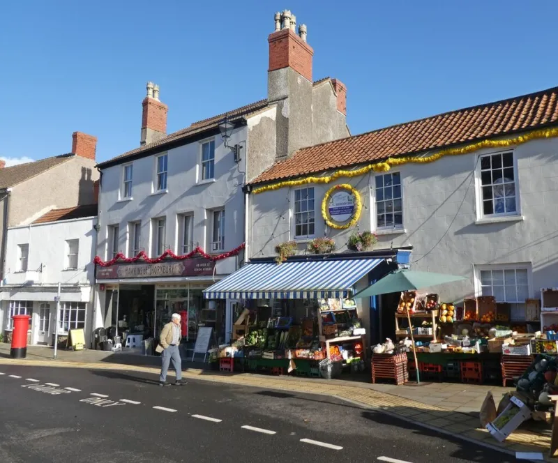
Photo: Roger Cornfoot , CC BY-SA 2.0, via Wikimedia Commons
There is a particular kind of honesty to a shopfront window. Unlike a campaign film or a social post, it cannot be scrolled past, muted or skipped. It sits between your brand and a pavement full of people who are already late, already wet, or already looking at their phone. For UK brands trying to express a bit of controlled dizzy energy, the window is both a gift and a trap. The gift is proximity. The trap is that glass, weather, depth and local rules all conspire to flatten even the boldest idea.
This is not about turning every window into a circus. It is about landing one deliberate wobble — a tilt, an off-axis object, a surprising colour block — that reads clearly from three metres away and still feels like your brand when the rain smears the glass.
The glass is the enemy (and the point)
Start with the obvious: a shopfront window is a mirror before it is a display. On a grey November afternoon, the dominant visual may be the bus opposite, the pedestrian in a red coat, or the sky. If your window relies on subtle tonal contrast, it will lose. Design for the reflection, not against it.
That means high-contrast shapes, large areas of one strong colour, and a clear silhouette. A single off-kilter element — a tilted plinth, a leaning poster, a wonky stack of boxes — needs to hold its shape even when half of it is obscured by a reflection of a delivery van. Test it with a phone camera from the pavement at different times of day. If it reads as a grey smudge at 4pm in February, it will read as a grey smudge to most of your audience.
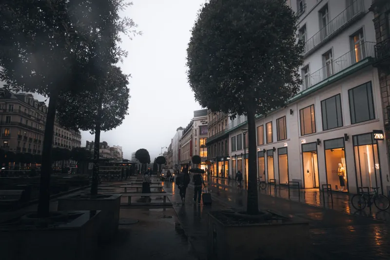
Rain adds a second layer: streaks, droplets and condensation. Matte surfaces and deep colours can help; glossy finishes can turn into a fog. If the window gets direct rain, consider a subtle internal light or a backdrop that gives the wobble something to sit against. The goal is not to fight the weather but to give the eye one clean anchor.
Depth is a rumour
Most UK high-street windows are shallow. A pop-up might give you a metre; a listed building might give you less. If you plan a layered theatrical set, you will end up with a compressed mess. Instead, think in two planes: a bold background and one foreground wobble.
The background can be a wrapped vinyl, a painted panel or a simple fabric drop. It gives you control over colour and reflection. The foreground is where the dizzy moment lives: a single object that breaks the grid. One angled shelf. One oversized prop. One headline set at a slight rotation. Resist the urge to fill every centimetre. Empty space is not wasted; it is the pause that makes the wobble legible.
For reception glass — the internal windows in offices and studios — the same rule applies, but the audience is slower. People linger, so you can afford a second layer of detail. Even there, one wobble is enough. Two wobbles become a puzzle.
The half-second pavement read
Footfall is fast. A shopper walking past gives your window maybe half a second before their brain decides whether to slow down. That is not enough time for a clever nested concept. It is enough time for one strong shape, one clear colour and one legible line of type.
Think of the window as a poster with a frame. The headline should be readable from the opposite pavement, not just from the door. The wobble should be visible in peripheral vision. If you have to point it out to a colleague, it is too quiet. If it looks like a jumble sale from ten metres away, it is too loud.
A useful test: stand across the street and squint. What survives? That is your hierarchy. If the answer is 'the reflection of the charity shop opposite', go back to the bench.
Council rules and the art of the permissible wobble
UK shopfronts come with a quiet rulebook. A-boards on the pavement need permission from the local authority. Illuminated signs may need advertisement consent. Listed buildings and conservation areas can restrict fixings, materials and even colour. None of this is designed to kill creativity, but it does shape where the wobble can live.
The trick is to separate the brand moment from the regulated signage. Your fascia sign may have to stay traditional; your window display can still tilt. Use removable fixings, freestanding props and internal graphics where external consent is tight. If you are in a conservation area, check whether the window itself is protected before you tape anything to the glass. A quick call to the council's planning team is cheaper than an enforcement letter.
Also consider accessibility: keep the pavement clear, avoid low obstructions and make sure any text is at a readable height. A dizzy brand should not be a trip hazard.
A simple framework: one wobble, three anchors
When we work on shopfront windows, we use a simple checklist to keep the idea controlled.
- One wobble. Choose a single element that breaks the expected line — a tilted plinth, an off-axis headline, a leaning stack. Everything else stays calm.
- One colour field. Give the wobble a strong, plain background so it does not compete with reflections or surrounding clutter.
- One repeat cue. Borrow a shape, colour or type treatment from your wider brand system so the window feels connected, not random.
- One pavement test. Check it from three distances: door, opposite pavement, and across the street. If it fails the squint test, simplify.
- One weather check. View it in rain, at dusk and in flat grey light. Adjust lighting or contrast until the wobble survives.
That is it. No need for a ten-point manifesto. The framework is deliberately small because the window is a small stage.
Pop-ups, receptions and the temporary wobble
Pop-up retail and reception glass share the same constraints but different rhythms. A pop-up might only last a weekend, so the wobble can be more playful and less permanent — cardboard, tape, chalk, a rented prop. Reception glass is seen every day, so it needs to age well. A subtle tilt in a printed graphic or a single off-kilter object on a shelf can do more than a full themed installation.
In both cases, keep the exit in mind. How will you remove it? Will the fixings damage the glass or frame? A good wobble leaves no trace.
The last word
A shopfront window is not a billboard. It is a conversation with a pavement. The UK high street is full of noise, weather and rules, and the brands that stand out are not the ones that shout loudest. They are the ones that give the eye one clear, deliberate surprise — and then get out of the way.
If you are planning a window for 2026, start with the glass, the rain and the half-second look. Then add one wobble. Keep it readable, keep it removable, and keep it yours.