Shared Room, Separate Voices: Building a Third Language for UK Collaborations
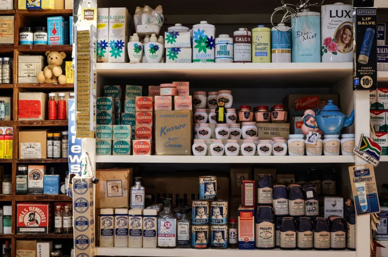
A collaboration is not a merge. It is a staged encounter. Two brands walk into the same room, and everyone watching wants to see what happens next. Too often, though, the answer is visual mush: two logos politely sharing space, two typefaces cancelling each other out, two colour palettes averaging into beige. The partnership may be commercially sensible, but creatively it has no pulse.
For UK marketing managers briefing a limited edition, a retail tie-in or a sponsorship campaign, the opportunity is bigger than borrowed audiences. The best partnerships build a deliberate third language — a way of looking, sounding and behaving that could only exist because these two brands met. It borrows tension, contrast and surprise from both sides, then turns that into something neither brand could own alone.
Start with the friction, not the friendship
Most co-branding briefs begin with shared values. Lovely for the press release, less useful for the design studio. Shared values explain why the partnership is permissible; they rarely explain why anyone should notice it.
Ask a sharper question: where do these brands usefully disagree? One might be sober, the other loud. One heritage-heavy, the other restless. One built on restraint, the other on cheerful excess. That friction is the raw material. It gives the campaign a shape.
This is not about manufacturing conflict for the sake of it. Legal, ethical and reputational lines still apply. But within those lines, a bit of productive tension is what stops a collaboration from becoming a corporate handshake with a logo on it.
The third language is a grammar, not a logo lock-up
The lazy version of co-branding is to put mark A next to mark B and hope the audience does the work. The stronger version is to define a shared visual and verbal grammar: a way of cropping images, a rhythm for headlines, a colour clash used consistently, a motion cue, a tone of voice, a recurring phrase.
Think of it as a dialect. It should be recognisably related to both parent brands without being a direct copy of either. A heritage grocer pairing with a streetwear label might land on a third language of market-stall chalkboards meets runway editorial: hand-written price flashes, sharp photographic crops, one unlikely acid accent. A fintech partnering with a festival might create a language of calm utility under joyful noise: clear numbers, playful movement, one shared sonic sting.
The test is simple. Cover the logos. Does the work still feel like a specific partnership rather than a generic campaign? If yes, the third language is doing its job.
A practical framework for the brief
Call it Two Into Three. It is a short sequence to keep teams honest before the decks get too thick.
-
Name the collision in one sentence. Not “a celebration of shared values” but “precision brand meets chaotic craft brand” or “everyday utility meets Saturday-night glamour.” If the sentence is dull, the campaign probably will be too.
-
Choose three borrowings from each side. Be specific: a typographic behaviour, a photographic treatment, a colour rule, a sound, a phrase, a material. Six ingredients is usually plenty. More than that and the third language turns into a jumble sale.
-
Set one governing constraint. This is the rule that stops the partnership becoming a free-for-all. It might be “one accent colour only,” “no more than two typefaces,” “motion appears once per scene,” or “the host brand owns the navigation, the guest brand owns the interruption.” Constraints create recognition.
-
Design a shared signature. Give the collaboration one ownable asset: a pattern, a transition, a packaging device, a catchphrase, a way of framing the product. It should be portable across shelf, social, out-of-home and retail staff uniforms without falling apart.
-
Test at first glance and second glance. At first glance, can someone tell two brands are involved? At second glance, can they tell what is new about the pairing? If the answer to either is no, the work is either too shy or too smug.
Make the host and guest roles explicit
Visual mush often comes from a lack of hierarchy. Both brands want equal billing, so every element gets equal weight. The result is noise.
Decide early whether the partnership is a host-and-guest arrangement or a true equal split. A retail tie-in usually needs a host: the shop, the platform, the venue. A limited edition may need a more balanced exchange. A sponsorship campaign often works best when the sponsor provides a recognisable frame and the sponsored property provides the energy inside it.
Hierarchy is not surrender. It is direction. One brand can lead the layout while the other leads the tone. One can own the background system while the other owns the moment of surprise. Clarity beats a committee-designed compromise.
Watch for the four symptoms of mush
Most weak collaborations show the same warning signs. Too many logos competing at the same scale. Two typefaces set at similar weights with no clear job to do. Colour palettes blended until nothing has authority. And copy written by consensus, which means it says everything and commits to nothing.
The fix is rarely more decoration. It is usually more contrast. Give one brand the straight line and the other the wobble. Let one be the anchor and the other the spin. A little off-kilter is good. A wobbly table is not.
Plan the breakup before launch
Collaborations end. Limited editions sell through. Sponsorships finish. Retail windows come down. The third language should be designed to retire cleanly, with clear rules on asset ownership, expiry dates and which elements return to each parent brand.
That sounds like admin, but it protects the creative idea. A third language with no exit plan tends to hang around awkwardly, turning a sharp campaign into a permanent accidental sub-brand. Decide what disappears, what gets archived and what — if anything — gets adopted by one side.
The double act test
The best UK brand partnerships feel like a good double act. Not two people talking over each other, and not one person doing a solo while the other holds the microphone. They feel like two distinct voices creating a third thing in the space between them: tense, funny, surprising and unmistakably theirs.
So before you sign off the next collaboration, ask the room a blunt question. Are we actually building something together, or are we just standing near each other with logos on? If it is the latter, go back to the friction. That is where the good work starts.