Commuter Optics: Designing Dizzy Out-of-Home for the Half-Second Look
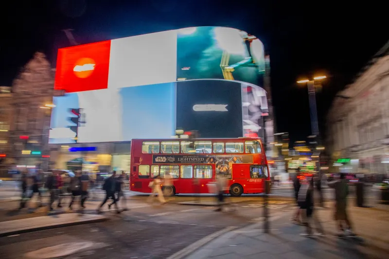
Out-of-home is rarely a viewing experience. It is a collision. A bus side slides past a queue; a roadside 48-sheet appears between lampposts; an escalator ad arrives in vertical slices as people step and scroll. By the time a static campaign deck has finished explaining its cleverness, the audience has already gone up an escalator and bought a meal deal. For Dizzy-branded work, that is not a reason to behave. It is a reason to design for the fragment.
The temptation with a lively brand is to treat every OOH format like a poster in a portfolio shoot. Everything is placed. Every element has room. The wobble is perfectly balanced against the headline, and the whole composition rewards a long, appreciative look. Then it goes on the side of a bus and the appreciation lasts roughly as long as a traffic light. The wobble does not disappear because the idea is weak. It disappears because the idea was built for stillness.
Design for the glance, not the gawk
A useful starting point is to stop asking what the poster looks like and start asking what survives. What remains in the mind after someone has seen it for less than a second, at an angle, in the rain, while checking a phone? That is the real creative unit. Not the full layout. The residue.
For UK OOH, that residue has to work across some very different physical situations. A bus side is a horizontal strip viewed sideways and often partially blocked. A 48-sheet is a roadside stage with a hierarchy problem: the audience is further away, moving faster and possibly looking through a windscreen. An escalator panel is vertical, close and oddly chopped by the steps and the bodies in front of it. These are not variations on the same canvas. They are different reading conditions, and the Dizzy brand has to stay recognisable inside all of them.
Give the eye one job
When attention arrives in fragments, hierarchy is not a design preference. It is survival. The eye needs a first stop, a second stop and a reason to keep the image in memory. If the layout offers five equal attractions, the viewer will take none of them. A tilted headline, a circular mark, a colour block, a product shot and a witty aside cannot all be the lead singer.
A practical test is to cover everything except one element and ask whether the campaign still has a pulse. If the answer is no for every element except the logo, you have a recognition problem. If the answer is yes for three different elements, you have a hierarchy problem. The strongest OOH work usually has one dominant cue, one supporting line and a clear brand anchor. The wobble can live in the dominant cue, but it should not be spread across the whole poster like jam.
Bus sides reward the sideways read
Bus sides are a lesson in horizontal thinking. The format is long, shallow and frequently interrupted by wheels, windows, door seams and whatever street furniture happens to be in the way. A composition that depends on a perfect centre is asking for trouble. Better to build around a repeatable anchor: a mark near one end, a headline that can be read in two chunks, a colour field that holds the strip together when the middle is obscured.
This is also where fussy detail goes to die. Thin strokes, delicate gradients and small captions are not brave. They are optimistic. At speed, the bus side has to read like a sentence, not a paragraph. If the Dizzy moment depends on a subtle off-axis alignment that only works when the viewer is square-on, it is probably a digital layout wearing an OOH coat.
Escalators are captive, but not patient
Station escalators feel generous because the audience is close and temporarily trapped. In reality, the dwell time is chopped into steps, heads, handrails and the small panic of remembering where you are going. The panel is vertical, which is useful, but the reading pattern is stop-start. Top and bottom zones do more work than the middle. A single strong image can hold the space, but the headline needs to land before the viewer starts mentally rehearsing their platform change.
This is where motion-safe contrast matters. High contrast is not just a accessibility box-tick; it is how an ad survives bad lighting, reflections and a moving crowd. Avoid thin type over busy photography. Avoid low-contrast palettes that look sophisticated on a studio screen and turn to mush under fluorescent light. And avoid any cue that depends on flicker, rapid repetition or a visual effect that could be uncomfortable for viewers with motion sensitivity. A Dizzy brand can be lively without being a hazard.
Test at commuter speed, not presentation speed
Most OOH testing happens in a room where everyone is standing still and nobody is late. That is not the audience. A simple commuter-speed test can be done with a phone, a printout and a bit of honesty. Scale the artwork down, view it from across the room, then walk past it while glancing once. Repeat while talking. Repeat while looking at a phone and then up. The question is not whether it looks good. The question is what you can still name afterwards.
A useful five-stop check looks like this. First, the squint test: can you identify the main shape and colour from a blur? Second, the blink test: what remains after a single blink? Third, the peripheral test: can you catch the cue while looking slightly away? Fourth, the grayscale test: does the hierarchy survive without colour? Fifth, the recall test: can someone describe the one memorable cue after seeing it once? If the ad only works when someone is told what to look for, it is not ready for the roadside.
Keep one cue, then repeat it
The most reliable way to survive the commute is repetition with discipline. Choose one cue that belongs to the brand and can travel across formats: a tilted full stop, a circular crop, a recurring colour block, a deliberately off-centre mark. Then let that cue do the dizzy work while the rest of the layout stays calm. The cue becomes a small signature the viewer can catch at speed and recognise later, even if they cannot remember the whole ad.
That is the difference between a campaign that looks distinctive in a case study and one that behaves distinctively in the wild. The wobble is not the whole poster. It is the thing the poster leaves behind. Design for the half-second, test for the fragment, and the full look will take care of itself.