Optical Allsorts: Getting a Single Dizzy Moment Right in a UK Campaign
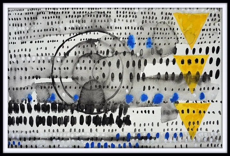
Photo: Bruce Black, CC BY-SA 4.0, via Wikimedia Commons
Dizziness is easy. Stick a striped background behind a rotating gradient and half the room will feel seasick within four seconds. Making people enjoy that feeling — actively lean in, screenshot it, send it to a mate — is a different discipline altogether. It's the gap between a fairground ride and a fairground ride you'd queue forty minutes for.
We named the studio Dizzy Design, so we have a professional stake in this. Here's how we think about one deliberate wobble in a campaign, and where the line sits between delight and a health hazard.
Two kinds of tilting
Not all visual disorientation is created equal. There's the sort that rewards attention, and the sort that just makes someone put their phone down and go and put the kettle on.
Look at British optical play for the difference. Bridget Riley's Movement in Squares — held at Tate, and still the reference point for the whole genre — is vertiginous precisely because it's disciplined. The grid is rigid. The geometry is exact. Only the width of the squares does anything strange, and it does it slowly, left to right. The thrill comes from a single variable being pushed.
The same is true of the psychedelic sleeve work that came out of London's underground press in the late sixties — the posters and record covers from studios like Hapshash and the Coloured Coat. Those images look like chaos at a glance. Look properly and you'll find a very plain structure underneath: a band name, a title, four or five colour separations, one central figure. The wobble is contained by boring bones.
That's the whole principle. Stability first, then one axis of instability. If everything is loud, nothing is.
The one-spin rule
When we're planning a disorienting moment for a client, we run through five decisions before anyone opens a design file.
- The anchor. What stays utterly still? Usually the logo lockup, the headline and the primary call to action. The anchor is a promise: this will not move, and you can read it whenever you like.
- The axis. Pick exactly one kind of optical movement — a slow rotation, a moiré ripple, a chromatic offset on a single layer, a parallax drift, a scale breathing effect. Two axes is a hedge; three is a headache.
- The duration. Short beats long. A 600-millisecond flourish at the moment of arrival will be remembered. A 30-second loop will be muted, scrolled past, or closed.
- The exit. How does the viewer stop it? A tap, a scroll, a hover-end, a timer. If there is no exit, it isn't a design decision — it's a trap.
- The volume. How much of the canvas does it occupy? We usually cap it at roughly a fifth of the visible layout. The rest stays legible, calm, and — crucially — boring in the best sense.
Get those five right and you've built something people will play with. Get them wrong and you've built a loading screen that feels like an eye test.
Keeping the fun legal
Here's the part that separates a campaign you can defend in a client meeting from one that ends up in a complaints inbox. Motion sensitivity is not a niche concern — a meaningful slice of any UK audience has vestibular disorders, migraine triggers, or simply a low tolerance for busy screens at 7am on a commuter train.
So we treat these as non-negotiables, not nice-to-haves:
- Respect reduced motion. Honour the
prefers-reduced-motionmedia query and ship a calm static version that is genuinely designed, not just the animated version paused on an awkward frame. - Give people a pause. Anything that loops for more than five seconds needs a visible stop control — that's the spirit of WCAG 2.2.2, and it's just good manners.
- Never animate the reading surface. Text sits on a still layer. The movement happens behind, beside, or between content blocks — never under a paragraph.
- Watch the flashing. Nothing above three flashes per second, ever. This is seizure territory, not stylistic territory.
- Hold your contrast. A 4.5:1 ratio for body copy, 3:1 for large text, and check it against the moving backdrop at its brightest and darkest frames — not just the average.
- Keep the reading order intact. Whizzy layout tricks that reorder content for screen readers are a hard no. The DOM stays linear; the spectacle stays on top.
- Test the print version. If you're running lenticular or moiré out-of-home, look at the proof at 100% on a wall, then again at three metres. What sings on a monitor can strobe on a wet Tuesday at a bus stop.
Where a spin earns its keep
In practice, there are a handful of placements where a single dizzy moment does real work rather than decoration. The first three seconds of a social film, where you're fighting for a thumb. A section break on a long scrolling page, where you want a small jolt of energy before the next argument. Packaging, where a pattern that shifts as the box turns in the hand gives you a genuine reason to pick it up. Event stands, where the whole job is to stop a delegate walking past. And out-of-home, where the surrounding environment is already visual noise and you need something that refuses to blend in.
What these have in common is that the disorientation is doing a job — attracting, punctuating, rewarding — rather than being the whole personality of the brand.
Test it on a person, not a mood board
Two cheap tests before sign-off. First, the squint test: blur your eyes at arm's length. If you can't find the headline and the logo, the anchor has failed. Second, the twenty-second test: sit with the piece for twenty seconds without clicking. If you're irritated by second eight, your audience will be too.
And then the obvious one — put it in front of someone who actually suffers from motion sickness. Not as a box-tick. As a design critic. They'll tell you things no accessibility checklist will.
A dizzy moment is a punctuation mark. One per paragraph, placed with intent, and the sentence reads beautifully. Sprinkle them everywhere and you've just written noise.
Working on a campaign that needs a jolt without the nausea? That's roughly 60% of what we do.