The Wobble Test: Seven Checks Before You Call That Campaign Bold

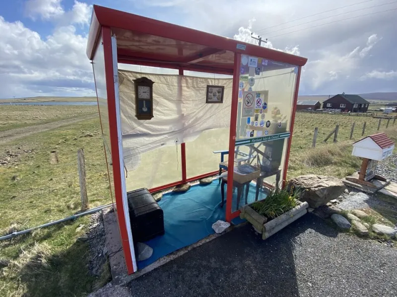
Photo: Support Startup, CC BY-SA 4.0, via Wikimedia Commons
Every UK marketing team has been in this meeting. An agency presents an idea that is genuinely distinctive. Someone in the room says it feels ‘a bit much’. Someone else asks whether it will ‘land with the core customer’. A third person suggests adding a celebrity, a tagline, and a QR code. Twenty minutes later, the brave idea has been sanded down into a beige social post with a stock image of a smiling cyclist.
Meanwhile, genuinely wobbly work — clever-clever concepts, overcomplicated narratives, ideas that need a 12-slide explainer — sometimes sails through because it sounds ‘strategic’. That is the wrong way round.
This is where the Dizzy Audit comes in. It is not a scientific model. It is a practical set of checks for separating bold brand ideas from ideas that are merely wobbly. Score each one from 1 to 5. Be honest. A total of 28 or more is a sign you might have something worth fighting for. A low score does not mean the idea is bad — it means it needs work before it meets the boardroom.
1. Can you explain it in one breath?
Bold does not mean baffling. If the idea needs a paragraph, a diagram, and a caveat about ‘audience interpretation’, it is probably wobbly. This does not mean every campaign must be simple. It means the core thought should be clear enough to repeat in a lift.
Think of Sport England’s This Girl Can. The insight, the attitude, and the visual world were all distinct, but the idea could be understood instantly. That is not simplistic. That is disciplined.
Score 1: The idea needs a deck to explain it. Score 5: A stranger could retell it after one exposure.
2. Does it break a category convention — on purpose?
Distinctive work usually has a clear enemy: the default way the category behaves. Compare the Market’s meerkats were not just a random mascot. They were a deliberate break from the self-serious, price-comparison clutter of insurance advertising. The weirdness had a job.
Ask: what convention are we breaking, and why does breaking it help the brand? If the answer is ‘because we wanted to be different’, keep digging. If the answer is ‘because everyone else talks like this, and our customer is tired of it’, you are onto something.
Score 1: Different for the sake of it. Score 5: A clear convention, deliberately subverted.
3. Is the oddness load-bearing?
A bold idea should carry meaning. If you remove the unusual element, does the campaign collapse — or does it just become more normal? Aldi’s Kevin the Carrot works because the character is part of a consistent brand world, not a random piece of festive chaos. The oddness is load-bearing. It holds up the tone, the storytelling, and the memorability.
Wobbly work often uses weirdness as a shortcut. It hopes that strange equals interesting. Sometimes it does. Often it just creates confusion that the brand then has to spend money explaining.
Score 1: Oddness is decoration. Score 5: Oddness is the idea.
4. Does it survive the mute, scroll, and six-second test?
In 2026, most brand ideas will first be encountered in a feed, with the sound off, by someone who is only half-looking. That is not a reason to make everything shallow. It is a reason to design for recognition.
Can the idea land visually before it lands verbally? Does it have a distinctive asset — a character, a colour, a motion cue, a format — that survives without explanation? If the idea only works in a 60-second hero film with sound on, it is not necessarily bad. But it is fragile.
Score 1: Only works in a controlled presentation. Score 5: Recognisable in a crowded feed, even on mute.
5. Can a stranger retell it?
This is the pub test, the group-chat test, the ‘what did you see last night?’ test. If someone cannot describe the campaign to a friend without sounding like they are reading from a strategy document, the idea has a memory problem.
This does not mean the work must be dumb. It means the distinctive hook must be sharp enough to travel. Compare the Market’s meerkats, Aldi’s Kevin, and This Girl Can all have a retellable core. You do not need to remember the media plan. You remember the idea.
Score 1: Impossible to summarise. Score 5: Easy to describe, hard to forget.
6. Does it have a spine, not just a stunt?
Brave work can still be empty. A stunt might get attention, but does it connect back to something the brand actually believes or does? The best bold ideas are not random acts of creativity. They are expressions of a brand truth, turned up loud enough to be noticed.
Ask: if this campaign disappeared tomorrow, would the brand be diminished? If the answer is no, you may have a stunt rather than a brand idea. Stunts have their place, but they should not be mistaken for long-term distinctiveness.
Score 1: No connection to brand truth. Score 5: Inevitable-seeming expression of the brand.
7. Can you defend it without using the word ‘engagement’?
This is the boardroom check. Risk-averse rooms love the language of safety: ‘Will it land?’, ‘Is it on-brand?’, ‘Have we tested it?’ Those are fair questions. But if the only defence of the work is that it will drive engagement, you are in trouble.
Can you explain why the idea is right for the brand, right for the audience, and right for the moment? Can you show the convention it is breaking and the memory it is building? Can you point to the distinctive assets it is reinforcing? That is how brave work survives. Not by being loud in the presentation, but by being clear about what it is doing and why it matters.
Score 1: Defence relies on vague promises. Score 5: Clear strategic and creative rationale.
How to use the scorecard
Add up your seven scores. Out of 35, anything above 28 is worth protecting. Between 20 and 27, the idea probably needs sharpening rather than scrapping. Below 20, be honest: you may have a wobble, not a bold idea.
But do not use the scorecard as a weapon. Use it as a shared language. The point is not to prove that one person in the room is right. The point is to separate brave work from confusing work, and to give marketing managers the confidence to defend the former when the room starts reaching for the safety scissors.
At Dizzy Design, we like work that makes the room slightly nervous and the audience slightly curious. That is usually a better sign than work that makes everyone nod and nobody remember. Bold is not the same as chaotic. It is distinctive with a spine. Use the audit, keep the nerve, and do not let a good idea get watered down into a QR code.