Postcard Punk: Borrowing Seaside Wit Without the Faded Kitsch
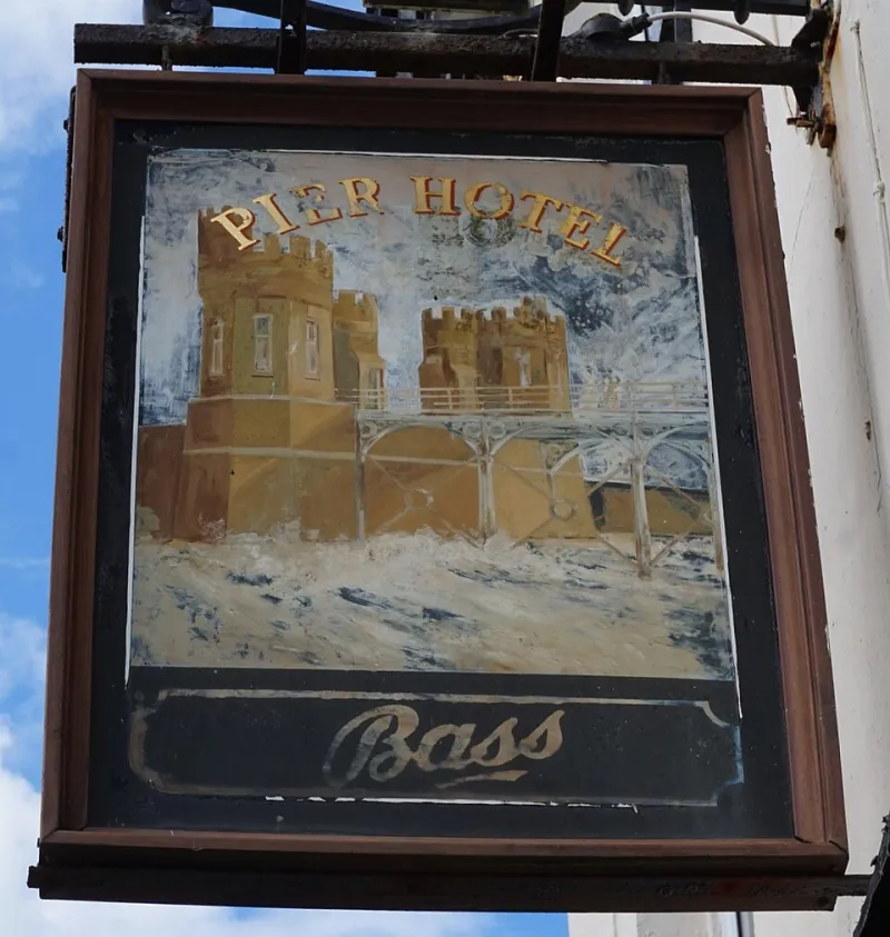
Photo: Ian S, CC BY-SA 2.0, via Wikimedia Commons
British seaside graphics are having a quiet moment. Not the ironic tea-towel version, but the real thing: hand-painted pier signs, postcard captions, fairground tickets, ice-cream van lettering and the cheerful clutter of a promenade. For UK brands looking for distinctive visual language, this is a rich, underused source. The trick is to borrow the grammar, not hire the costume.
Why seaside graphics still cut through
Seaside graphics were designed to work at a distance and at speed. A pier sign had to be readable from the end of the promenade. A postcard caption had to land in a rack of hundreds. A fairground ticket had to feel like an invitation, not a receipt. That forced clarity, colour and wit into the same frame.
The result is a visual language that is direct, high-contrast and unafraid of a joke. It is the opposite of the grey, rounded, softly-softly brand system that still turns up in too many UK pitch decks. Seaside graphics have edges. They have opinions. They have a sense of place without needing a heritage explainer.
For marketing managers, that is useful. It offers a route to distinctiveness that does not rely on being minimal, monochrome or moody. It can be warm, loud and human — three things many brands say they want and few actually deliver.
The difference between grammar and costume
Lazy pastiche is easy to spot. It is a distressed typeface, a fake postcard border, a pun about kisses, a sepia filter and a caption that says something like 'wish you were here' when the brand sells software. That is costume. It borrows the props without understanding the performance.
Grammar is different. It is the underlying system: direct address, bold outline, colour clash, asymmetric layout, comic timing, a caption that adds a twist to the image. You can use those principles without making your brand look like a gift shop in Whitby.
The test is simple. If you removed the seaside references, would the design still feel distinctive? If the answer is no, you have not built a brand language. You have built a fancy-dress outfit.
A starter palette that is not naff
Seaside colour is often reduced to rock pink and sky blue. That is a shame, because the real palette is stranger and more useful. Think pier blue, shell cream, mustard, mint, tomato red, fairground yellow and a deep navy that makes the brights sing.
The mistake is using all of them at once. Treat the palette like a postcard rack: a few strong cards, not a confetti explosion. Start with a grounded base — navy, cream or charcoal — then choose one or two brights as the attention-seeking pair. Keep contrast accessible, especially for digital. A cheerful palette should not be a cheerful accessibility failure.
A useful starting point for UK teams is a 60/30/10 split: 60 per cent calm base, 30 per cent signature colour, 10 per cent deliberate clash. The clash is the wink. It is what makes the system feel alive rather than merely tidy.
Typography: signage with a wink
Seaside lettering is full of useful moves: condensed sans, heavy slabs, outline type, hand-painted curves and numerals that look like they belong on a ticket booth. The trick is to pair one expressive display face with a clean, highly readable body face. Do not let every word shout. The caption should sound like a person, not a carnival barker with a megaphone.
Custom lettering can be a strong brand asset, especially for campaign headlines. But novelty fonts age quickly. If you want longevity, build a typographic system with one distinctive display voice and a calm supporting cast. The system should be able to be loud on a poster and quiet on a checkout page.
Wit responsibly
Seaside humour is part of the appeal, but it can go wrong. Innuendo can exclude. Regional stereotypes can flatten. A joke that punches down is not bold; it is just rude with better colours.
The safest route is warmth. Aim for wit that invites the audience in rather than shows off. Let the caption do some work: a small twist, a useful observation, a line that makes the image mean something more. If the joke needs a paragraph of explanation, it is not a postcard. It is a press release.
Three routes for UK marketing teams
First, the postcard caption system. Use campaign headlines as captions that sit beside an image, not above it. The image sets the scene; the caption delivers the twist. This works especially well for OOH, social and direct mail because it feels immediate and human.
Second, pier signage wayfinding. Borrow the directional confidence of pier and promenade signs for digital journeys. Big arrows, clear numerals, bold labels and a sense of progress. Make the user feel guided rather than processed.
Third, fairground ticket motifs. Use ticket stubs, stamps and perforations for offers, events and loyalty moments. It gives a campaign a tactile, collectable feel without requiring a full heritage story.
The Dizzy Design view is that seaside graphics should be a source of energy, not a filter. Build a system you can use again and again: a palette with a deliberate clash, a display voice with personality, a caption style with warmth and a layout that respects the audience's time.
Borrow the wit. Borrow the colour. Borrow the cheerful disorientation. But leave the faded kitsch on the rack. The best seaside graphics were never nostalgic in their own moment. They were direct, useful and full of life. That is still a strong brief for any UK brand in 2026.