The Route Less Ordinary: Carrying a Dizzy Brand Into UK Wayfinding
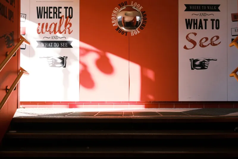
Wayfinding is where a brand stops posing and starts working. In a campaign, people choose to look. In a venue, they are late, they need the loo, and they are quietly furious that the car park ticket machine only takes coins. That is the moment your brand either helps or hinders. A controlled wobble can make a route feel owned. An uncontrolled one turns a fire exit into a riddle.
The stress test no one briefs for
Most UK marketing teams spend months on the campaign look, then hand signage to a facilities manager with a PDF and a prayer. It is understandable. Wayfinding feels operational: arrows, maps, door plates, a thousand little decisions about where to put the word 'toilets'. But it is also the most public expression of your brand. It is read at speed, in bad light, by people who are not in the mood for a design lecture. If your identity can survive a wet Tuesday in a Leicester arts centre, it can survive anything.
Arrows are a language, not decoration
The first rule is dull and non-negotiable: the arrow has to work. Point with the shaft, not the head. Keep the arrow and its destination in the same eyeline. Use the same arrow style across the family. If the route turns left, do not use a diagonal arrow pointing up-left because it looked better in the layout. That is not a wobble; that is a puzzle.
Arrows should also be redundant. Pair them with words, not just icons. A symbol of a train is useful; a symbol of a train next to 'Station' and a right-pointing arrow is useful under pressure. In the UK, we have a long history of decent public wayfinding, from the London Underground map to the humble motorway sign. The lesson is not to copy the look. It is to copy the discipline: one decision, clearly made, repeated without vanity.
Type that works at a trot
Display type is for posters. Wayfinding type is for people moving. That usually means a robust sans serif with a generous x-height, decent stroke contrast, and numerals that cannot be confused. Keep all-caps for short words and short distances. Sentence case often reads faster, especially for longer instructions. If you are specifying signage for a venue, test the type at the actual distance with the actual lighting. A font that looks crisp on a 27-inch monitor can turn to fog at eight metres in a dim corridor.
And do not rotate the text. A tilted word is a brand gesture; a tilted instruction is a usability problem. The wobble can live in the sign's frame, its colour block, its corner detail, or the tail of an arrow. It should not live in the sentence someone is trying to read while carrying a toddler and a coffee.
Contrast is not a mood board decision
Accessible contrast is where a lot of brave brand ideas quietly fall over. That soft grey on cream may look lovely in a lookbook. On a sign in a listed building with poor lighting, it is a ghost. Use the WCAG 2.2 contrast ratios as a floor for digital screens and aim higher for print, because real-world light is not a controlled studio. Do not rely on colour alone to separate routes or zones. Add numbers, names, patterns, or symbols. Follow RNIB guidance where you can, and remember that the Equality Act 2010 asks for reasonable adjustments, not a token gesture. Accessible wayfinding is not the enemy of a distinctive brand. It is the proof that the brand can behave in public.
Where the wobble belongs
This is the fun part, but only after the route works. Choose one or two repeatable moves and let them travel. A slightly off-axis arrow tail. A numeral set a few degrees off true. A colour block that leans into the next panel. A corner notch that appears on every sign like a little signature. Keep the arrow head straight, keep the text level, keep the hierarchy obvious. Then let the frame do the talking.
At Dizzy Design, we would rather see one confident wobble repeated across a whole venue than five clever ideas fighting for attention. The brand should feel present, not performed. A visitor should not stop to admire the sign. They should just feel that the place has a point of view, and then find the cloakroom.
Test the route, not the render
Before you print, walk the route. Then walk it again with someone who has never been to the building. Watch where they hesitate. Ask them what they thought the arrow meant. Check the sign in the evening, in the rain, and from the other end of the corridor. If a sign needs a caption to explain it, it is not working. If a wobble makes someone pause in the wrong way, move it.
Wayfinding is not the boring bit after the campaign. It is the campaign in real life, at eye level, for people who are already on their way somewhere. Get the route right, and the wobble becomes a welcome. Get it wrong, and you have designed a very stylish dead end.