Margin Notes: Twelve Ordinary Brand Moments Worth a Deliberate Wobble
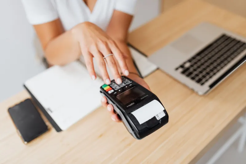
Every brand has its show pony. The spring campaign, the flagship film, the out-of-home that gets screenshotted into a hundred LinkedIn posts. And then there's the till receipt — the one piece of your brand that customers physically hold, screw into a ball and occasionally check for a refund window. Guess which one they encounter more often.
Distinctive brand memory doesn't get built exclusively in the hero moment. It gets built in the margins: the repetitive, low-stakes, high-frequency bits of admin that most marketing teams never see because they sit in operations, fulfilment or finance. Which is exactly why they're worth nicking back.
The idea isn't to turn every invoice into a circus. It's to pick a handful of these moments and give each one a small, controlled wobble — a bit of wit, a bit of motion, a bit of personality — so the brand feels consistent whether someone is watching your advert or wrestling with a returns label at 10pm.
Twelve candidates, each with a spin test you can run before you commit.
1. The till receipt
Paper or emailed, this is the most-repeated brand artefact in retail and the least art-directed. A footer line, a bit of type play, a tiny bit of upside-down mischief at the bottom.
Spin test: Would a customer photograph this and send it to a friend? If yes, you've got something. If it makes the queue slower, bin it.
2. Packaging seals and tear strips
Tamper seals, pull tabs, the little perforated strip you always tear the wrong way. These are moments of mild friction — a brilliant place for a one-liner that acknowledges the struggle.
Spin test: Does the joke survive being read in three seconds, one-handed, in a kitchen? If it needs a second read, simplify or cut.
3. The despatch note
The email that says your parcel is on its way deserves better than a grey table of SKU numbers. There's genuine anticipation here — it's the only piece of brand comms people actively refresh.
Spin test: Does it set a tone or just relay data? If you removed the logo, would anyone know who sent it?
4. Phone menus and hold music
Five minutes of silence is a brand experience whether you design it or not. A recorded voice with a bit of character, an interval that isn't generic library stock, an honest estimate of the wait.
Spin test: Would someone mention the hold music to a colleague? That's a much higher bar than it sounds.
5. Parcel tape and outer cartons
The outside of the box is public. It gets seen by the courier, the neighbour, the person in the lift. Most brands print a logo upside down by accident; very few do it on purpose.
Spin test: Does it work at a glance from a metre away? If it needs reading, it's a poster, not packaging.
6. The returns bag and pre-paid label
Returns are a low-trust moment. A bit of warmth here — a clear instruction, a light joke, a genuinely helpful diagram — buys more goodwill than a discount code.
Spin test: Does it reduce anxiety, or does it look like the brand is sulking? Never make a customer feel judged for sending something back.
7. The loyalty stamp card
Nine circles and a free coffee. It's a tiny piece of print design that gets looked at every single visit, and it's almost always ugly.
Spin test: Does the card itself reward a second look? If the tenth stamp is the only interesting thing on it, you've left value on the counter.
8. Invoices and remittance slips
The driest asset in the business, and the one that goes to clients who are about to decide whether to renew. A single well-placed line of warmth costs nothing and lands in a moment of rare attention.
Spin test: Is it appropriate for the finance team's worst day? Financial comms can be charming; they can't be flippant.
9. The compliment slip
That little printed note in with a delivery. Nearly extinct, which is precisely why it now reads as effort rather than habit.
Spin test: Would you keep it? A quick scribble beats a printed thank-you every time.
10. Appointment reminder texts
The most-opened message most service brands send, and the most likely to be written by whoever set up the CRM in 2019.
Spin test: Does it sound like a person or a parking meter? Keep it one line, keep it warm, keep the details bulletproof.
11. Care cards and instruction leaflets
How to wash it, how to fit it, how to pair it. Instructions are where design confidence shows, because clarity and character have to coexist.
Spin test: Can someone follow it while distracted? If the wit gets in the way of the diagram, the diagram wins.
12. Click-and-collect counter signage
A printed A4 in a plastic wallet, usually designed by nobody, in a location where the customer is standing still and mildly bored. Bored people read.
Spin test: Does it look intentional next to the rest of the store? Same typeface, same tone, minimum bar.
How to actually run this
Don't try all twelve in a quarter. Pick three, hand them to whoever owns the asset rather than whoever owns the brand book, and give them one instruction: make it feel like us, without adding a single second of friction.
Then measure the boring things — complaints, confusion, support tickets — before you measure the fun things. A wobble that makes a returns process harder isn't a brand moment, it's a cost.
The margins are where familiarity gets earned. The hero campaign reminds people who you are; the receipt, the label and the hold music convince them you're consistent. Spin the small stuff first.